❄️ Day 15 ❄️
Ready for some before vs after pictures of Trine 4 development? Here goes!
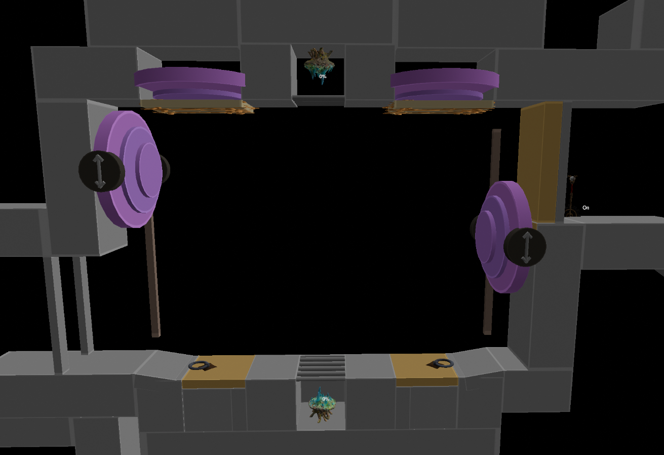
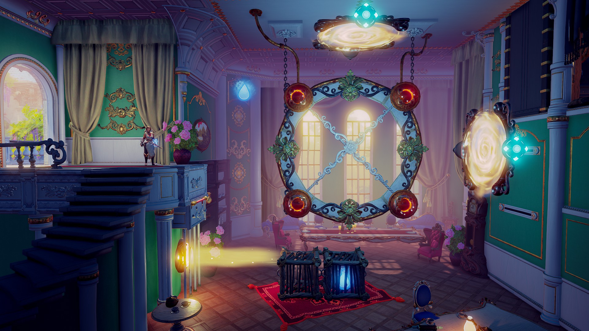
In the upper picture you can see the level design in progress without any added visuals. Compared to the after picture portals have changed quite drastically from purple blobs into these magical void gates. Let alone the beautiful art in the background that really makes the game world come alive.
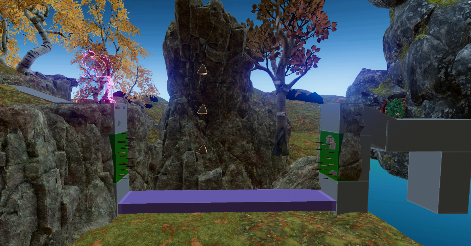
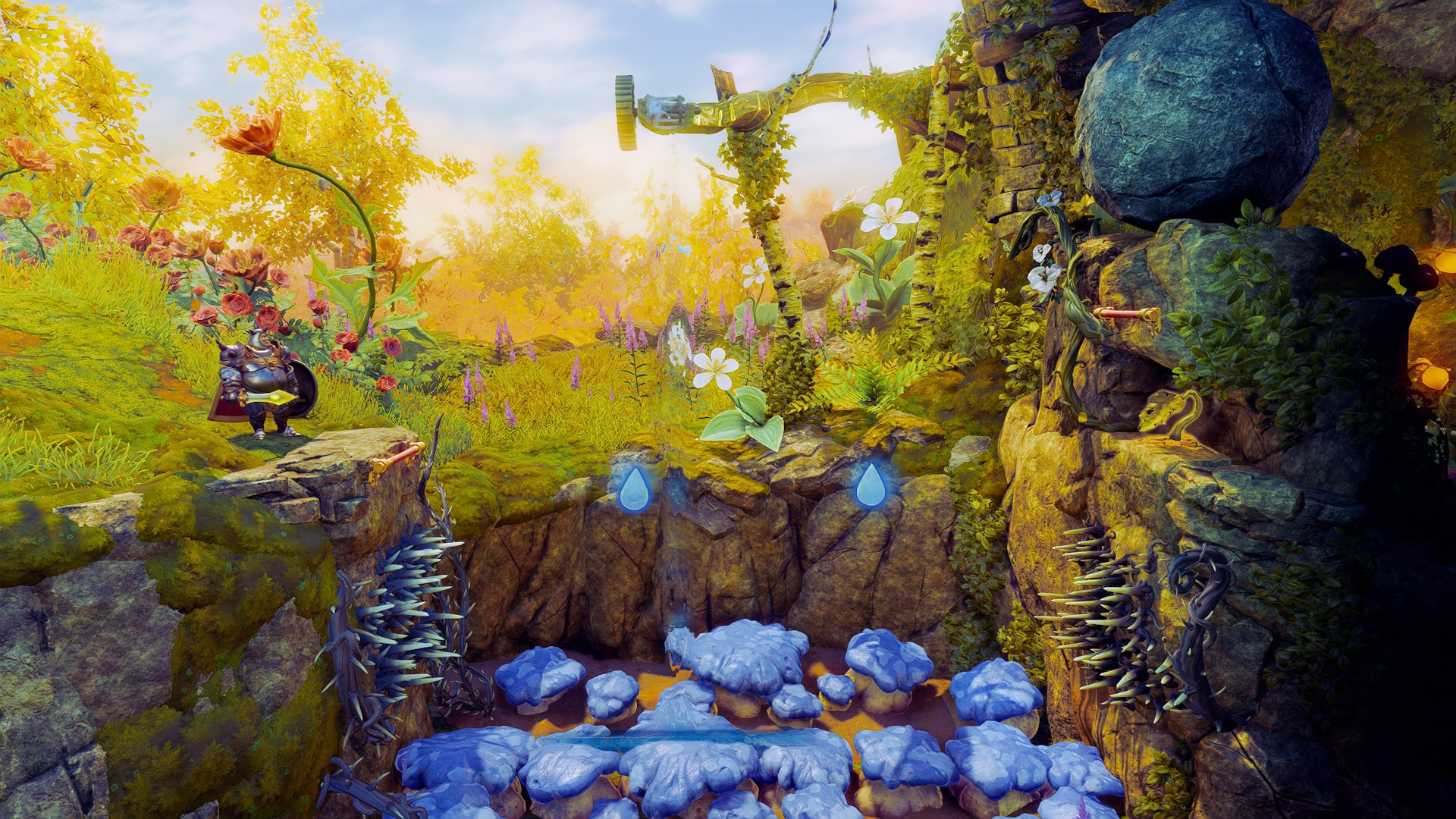
The next example shows a piece of level design that has already been updated with some graphics. The spikes seem to have gone through some major updates as well as the blue mushroom pit.
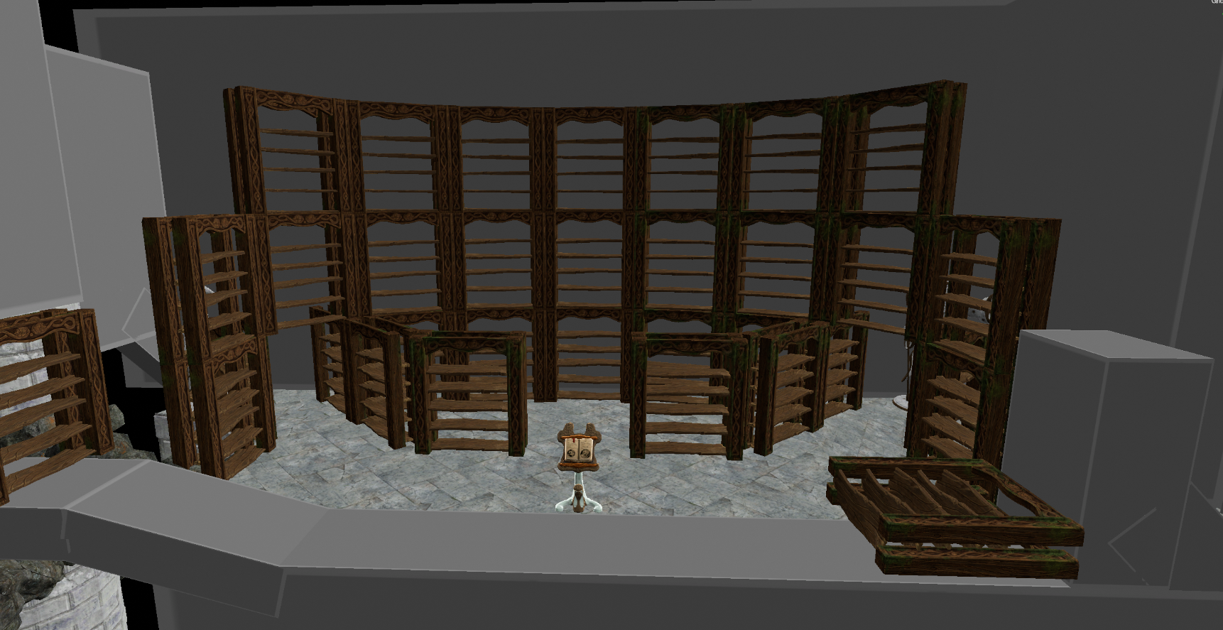
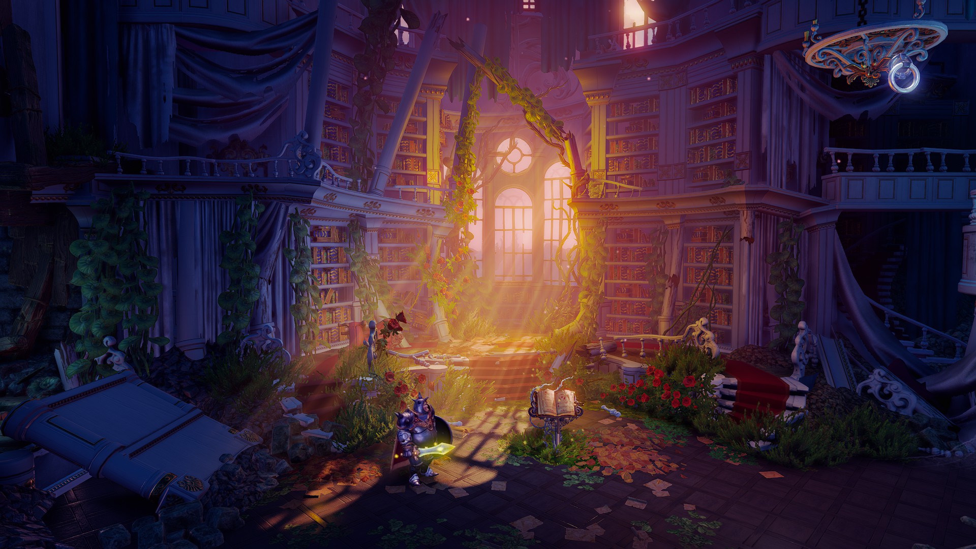
This piece is from the level ‘Heatherwood Hall’. Can you spot all the similarities? The library looks a lot safer in the first picture…
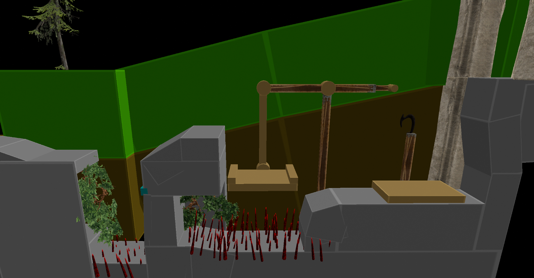
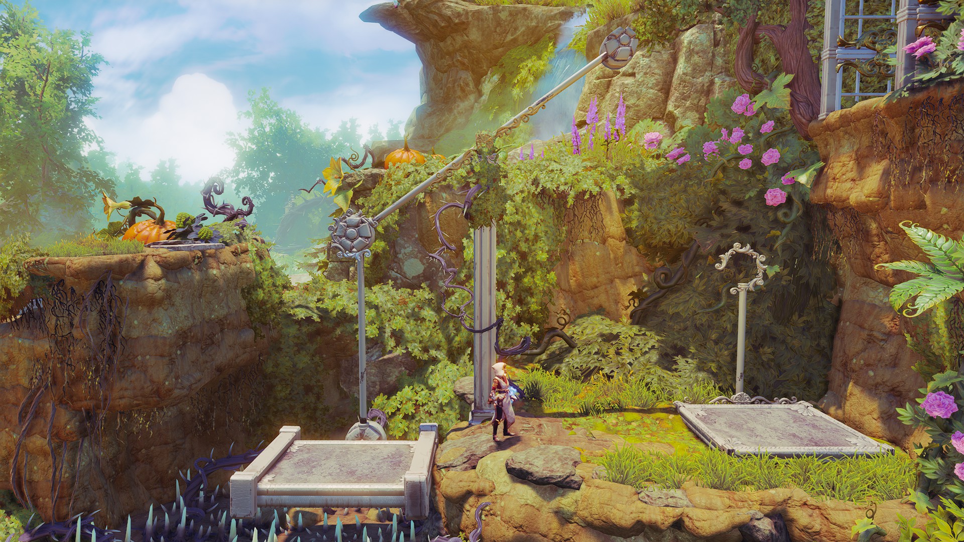
This one is from ‘The Thorny Hedge Maze’. The gameplay mechanics are pretty similar in both pictures, but obviously the visuals have upgraded greatly.
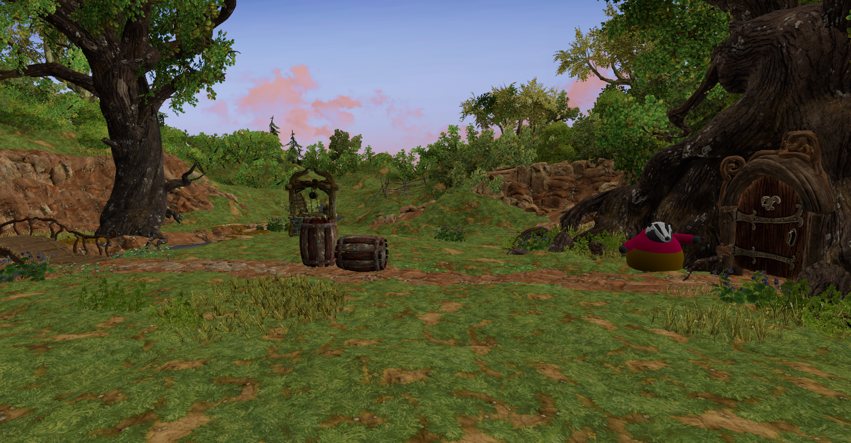
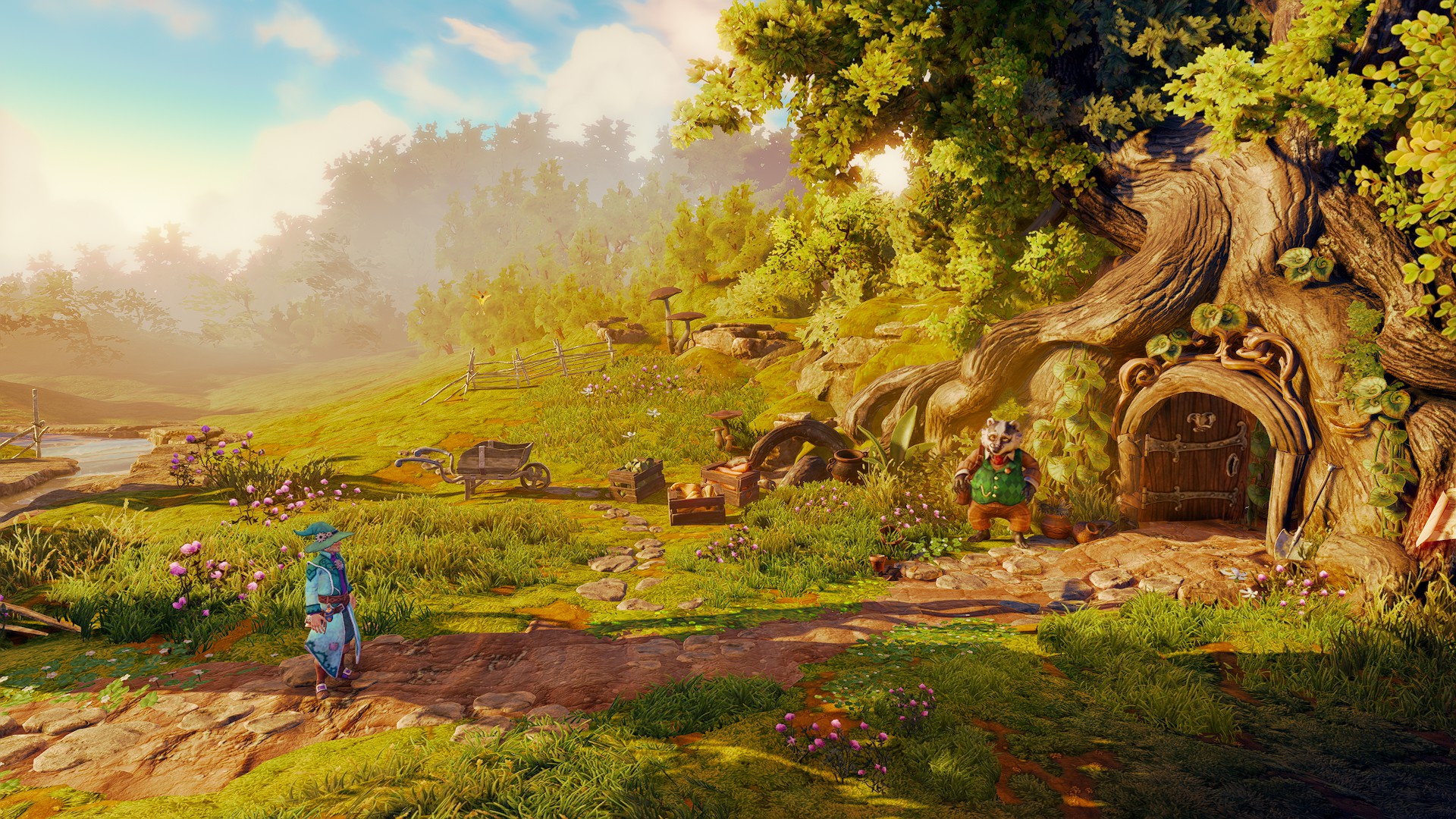
The last comparison is one of my personal favourites because of the badger and his makeover. The scenery and lighting are stunning in the after picture too. It seems that the badger’s well is gone, I guess there’s no need for one if you have a river right in front of your house 😀

Leave a Reply